You’ve been there before – you’re in the waiting area, killing time until your takeout is ready, and you’re glued to your phone. You open up a link from the hilarious email chain that’s been going around the office expecting to quickly see some of that quality internet content, but you can’t find it right away…
The text is too small. No problem, you turn your phone sideways. Well, now the text is just as small, and it’s stretched out from end to end. So you pinch, and swipe, then start tapping around aimlessly.
Now your fat finger touched a menu button by accident, and all you can see is a pop-up ad for one of those jewel games. Your food is ready, so you put your phone away without ever discovering the content, and now you’re going to hate-eat your sweet and sour chicken, which is a bad start to your afternoon.
And to think all this could have been prevented with responsive design.
Today, you’ll hear a lot of amateur designers talk about their websites being “mobile-friendly,” but really they’re only telling you half the story. There’s a huge difference between a “mobile-friendly” website and one that features a fully responsive design.
Websites that are just “mobile-friendly” may look and behave exactly the same on your phone or tablet as they do on your computer. These sites are simply shrinking their content down to a microscopic size in order to cram everything onto a screen small enough to hold in the palm of your hand. This also means the navigation, images and text can quickly become a jumbled, warped mess which ultimately forces you, the user, to start pinch-zooming in hopes of eventually making heads or tails of this. Come to think of it, that’s not very friendly at all.
What you really want is a developer who understands the ins and outs of responsive design.
To use an analogy away from technology, think of your website content like water free from a container. If you put water in a cup, it conforms to the dimensions of the cup. If you pour it in a vase, it becomes the vase. And on and on. In fact, this pattern remains true for any container in which you pour the water.
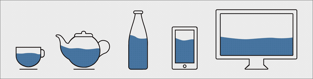
In the same way, your content needs to respond to the container in which it’s presented, and more often than not that container is going to be on the screen of a smartphone or tablet.
It’s no secret that over 60% of consumers digital media time is being spent on mobile devices, so it’s no longer good enough to think solely in terms of desktop design for your website.
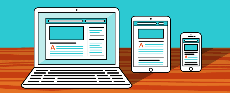
Some of the best responsive design doesn’t look exactly the same as their desktop counterparts, nor should they. In a proper responsive design the icons, images, text and all other elements of a website are given proper hierarchy and room to breathe. The user doesn’t have to think or make decisions on what content is most important – that’s because the site’s design presents every piece exactly as it should be.
There’s no doubt that Google has been frustrated by poorly-designed “mobile-friendly” sites more than a time or two, which is why their algorithms were adjusted to penalize sites for non-responsiveness. This means that you could have the most beautiful, intuitive desktop design with brilliant search engine optimization and still not rank highly in Google’s organic search results because you neglected the mobile version of your website.
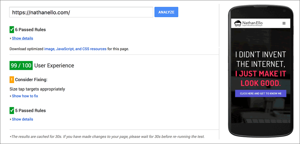
Lucky for you, this mobile readiness test that Google developed is just a click away.
Or, if your website already touts a fully responsive design you might consider giving this tool from Google a try instead. This second tool of Google’s that I’ve linked to will provide you with a mobile user experience score as well as some actionable recommendations if you’ve scored anything less than a perfect 100/100.
You don’t want to find yourself in the position of having to backtrack and scramble to convert your website into a responsive design. You’d rather get this done right the first time with a developer who can optimize the display of your content to fit any screen. Hiring professional developers is the only way to guarantee that your site, and your lunch break, will be as solid an experience as possible.
As a certified expert WordPress developer, I know what separates good websites from great ones.
My portfolio includes several websites that have scored a perfect 100/100 (or close to it) for their mobile user experience through Google’s readiness tests. So, if your website needs some help please get in touch with me today. I’d be thrilled to help ensure that your customers get the most from your content on every device.
[actionbox color=”primary” title=”READY TO START YOUR NEXT PROJECT?” description=”” btn_label=”Hire Nathan Today” btn_link=”https://nathanello.com/hire-me” btn_color=”white” btn_size=”big” btn_icon=”thumbs-o-up” btn_external=”1″]